1 min read
Safeguarding critical systems: what's your plan b?
We know that software is a major enabler in the digital transformation process. Whether you are in the early stages of your journey or are focused on...
ARTICLE
The last time you stood at a crossing and pressed the button, you probably didn't give it much thought. You waited for the beeps, watched for the light, and crossed.
But for a lot of people, that button is doing something much more important than calling a green light. It's the difference between crossing with confidence and not crossing at all.
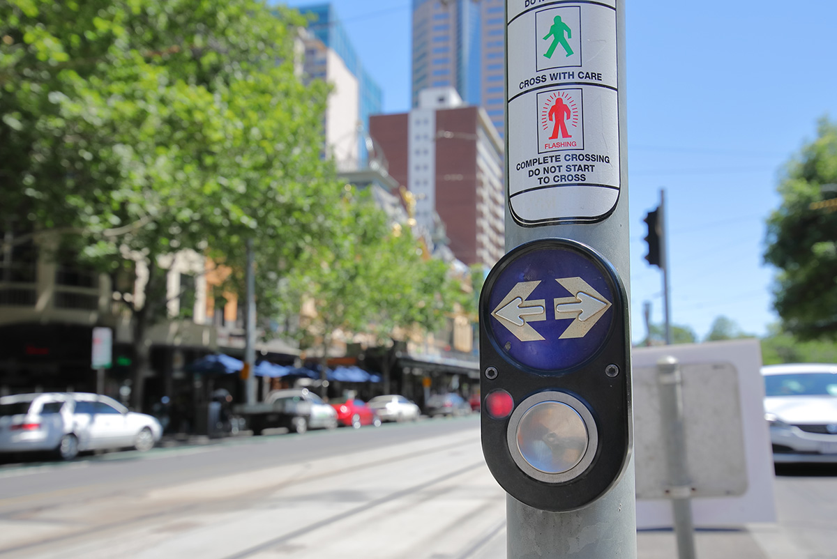
The standard Australian pedestrian button doesn't look high-tech. It doesn’t have a touchscreen or a display; however, it quietly delivers three things that matter enormously to people who can't rely on visual cues alone.
A two-rhythm audio signal distinguishes between "wait" and "walk". A sound so embedded in everyday life that it has its own cultural footprint (this video explains how it was used in Billie Eilish’s song, Bad Guy).
A vibrating touch panel provides tactile confirmation when audio isn't available, and a raised, printed arrow indicates the direction of travel, so users know exactly where the crossing leads before they commit.
One major factor that makes this design so strong is consistency. The same housing, the same logic, the same interaction across thousands of locations. People learn it once and can rely on it everywhere. That predictability is a type of accessibility feature.
The button shows what's possible when accessibility is treated as a core requirement from the start, instead of being added at the end. It's not perfect, but it proves the point.
Cassie Hames is an analyst at Nukon. She's also legally blind, and she navigates the road network in her daily life with low vision.
Recently, Cassie shared a deeply personal story of crossing a major road that required several consecutive crossings, each with a slightly different layout. During what should have been a safe crossing phase, a car passed directly in front of her, uncomfortably close.
"There was no warning," she says. "I hadn't heard it coming. I don't know if it was an unexpected turn, a red-light violation, or simply a moment of driver inattention. All I know is how close it felt and how shaken I was."
Cassie had approached the intersection in the same way she always does; she located the pole, pressed the button, waited for the audio and tactile cues, and crossed when the signal said it was safe.
The buttons at each crossing likely worked exactly as designed. The site may have met every relevant standard. But the mental map Cassie had built at the first crossing didn't quite hold at the second, then the third. Each had slightly different button placement, slightly different ramp positioning, and a slightly different feel. She was already carrying the cognitive load of adapting to each variation, and then the car passed by when it should have been a safe time for Cassie to cross.
None of that shows up in crash data. A near-miss doesn't register in a compliance audit. But it shapes whether someone feels safe using the network, and whether they continue to.
This is the gap the pedestrian button alone cannot close; a gap between a system that is technically correct and an experience that actually feels safe. Closing that gap requires listening to the people who experience it.
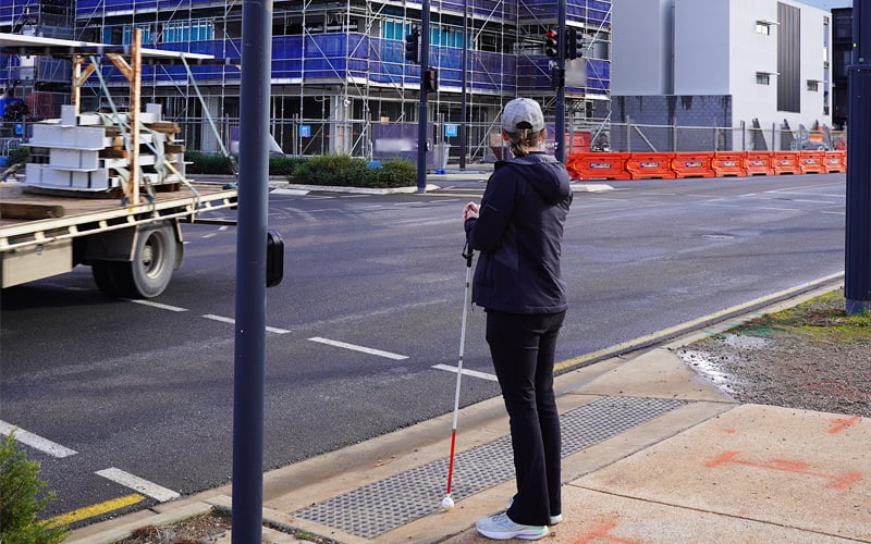
Pictured above: Cassie waiting to cross an intersection after pushing the pedestrian button. The
button has built-in accessibility features to help make crossings safer for pedestrians
who can't rely on vision alone.
Cassie navigates these gaps, but she's also one of the people working to address them.
As the creator of the See Me app, which makes public transport more inclusive by enabling users to hail buses remotely and receive real-time updates during their journeys, Cassie brings both her technical expertise and her lived experience to add perspective on the same problem.
Within Nukon and the wider SAGE Group, that perspective shapes how the team consults, designs, and tests. It’s expertise. Cassie knows what the data doesn't capture because she has felt it. She knows where the system's assumptions break down because she has experienced those breakdowns in real life.
This feedback and perspective have also been shared when we’ve consulted with and collaborated with See Differently. Unfortunately, accessibility and differing needs are too often overlooked in the early stages of design and sometimes ignored altogether.
We need to ask harder questions about whose perspective is considered in the system design, and what it would take to make it work for everyone.
 Pictured above: Cassie and Ashby Martin, Practice Lead at Nukon, alongside a SAGE digital kiosk.
The kiosks are an example of designs being continually adjusted to incorporate more
accessibility features.
Road safety is usually measured by crashes or incidents serious enough to generate a record. But safety also lives in the near misses, the moments of unease, the crossings people avoid because they don't feel confident using them.
The pedestrian button is a small, durable piece of evidence that good design can reach people that purely visual systems leave behind. Cassie's experience is evidence that good device design is necessary, but not always sufficient. The broader environment, the consistency of implementation, and the behaviour of other road users all shape whether someone can move through the network safely and with confidence.
As Cassie explains, "If road safety is truly about everyone getting home safely, it has to include people who don’t move, see, or hear the same way."
That framing asks something of everyone involved in designing and managing the network.
Getting that right means treating lived experience as data. It means designing with people who have direct stakes in the outcome, beyond designing for an assumed ‘average user’. It means being honest about the difference between a system that passes inspection and one that actually works for everyone who depends on it.
That's the work, and it starts with listening.
Designing for everyone is ongoing work, and it’s rarely solved by a single device, standard, or project. It takes curiosity and listening to find the right solution based on the needs of the users.
At Nukon, that’s the space we try to work in; combining advisory, design, and real-world insight to help organisations see where their systems or processes may not be intuitive or consistent for everyone. If you’d like to explore how your network, product, or service could better reflect the people who use it, get in touch with us today.
1 min read
We know that software is a major enabler in the digital transformation process. Whether you are in the early stages of your journey or are focused on...

1 min read
Reducing costly unplanned downtime, improving performance and agility – the promised advantages of Industry 4.0 certainly sound enticing.

1 min read
Manufacturing execution systems (MES) developed a reputation for being too rigid, expensive and out of sync with modern manufacturing operations. But...